Blazor Server – Basics Part 12 – Create a Native Blazor UI Toggle Button Component
In Part 11 I was showing how you can create a native Blazor UI Toggle Switch Component, now in this part we will see how we can create a native Blazor UI Toggle Button Component.
As already mentioned in Part 10, below you will first see what are the differences between a toggle switch and a toggle button.
Toggle Switch vs. Toggle Button
A toggle switch you usually use for binary options like on or off, for example a light switch to turn the light on or off. A toogle button in contrast usually is used for switching between different options (two or more) and realized for example with two or more controls next to each other where the selected option (control) is highligted.
So in Part 10 , I was also using the toggle switch component from Part 11 by utilizing a <input> element from type checkbox in the background. Even related to the context with selecting the payroll type, if hours or days, the correct term here would be toggle button.
In this part and for creating a toggle button with three options (states), this time I will use in the background a <input> element from type radio.
Create the CSS for our Toggle Button
Under the following link you will find some nice css styles for our 3 state toggle button.
3 State CSS Toggle Switch
https://stackoverflow.com/questions/23661970/3-state-css-toggle-switch
/* three state toggle button */
.switch-toggle {
    float: left;
    background: #000;
}

    .switch-toggle input {
        position: absolute;
        opacity: 0;
    }

        .switch-toggle input + label {
            padding: 7px;
            float: left;
            color: #fff;
            cursor: pointer;
        }

        .switch-toggle input:checked + label {
            background: #6610f2;
        }


.DisplayOption {
    color: #6610f2;
}
Create a Toggle Button directly in a Razor Page
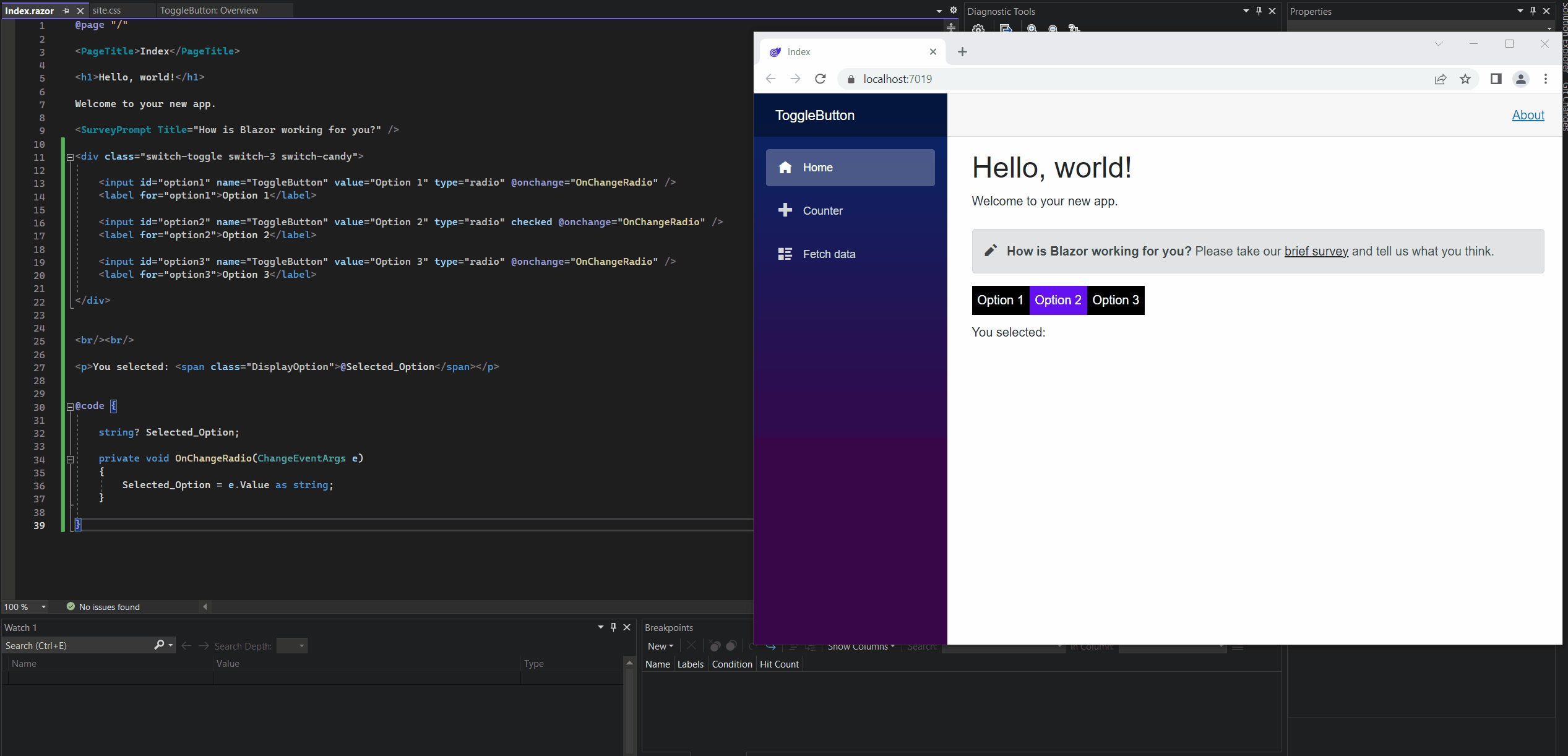
Here I will first show also like previously for the toggle switch in Part 11, how you can easily create a toggle button directly in the razor page.
The <input> and <label> elements I will put inside the <div> tag with my css styles.
@page "/"

<PageTitle>Index</PageTitle>

<h1>Hello, world!</h1>

Welcome to your new app.

<SurveyPrompt Title="How is Blazor working for you?" />

<div class="switch-toggle switch-3 switch-candy">

    <input id="option1" name="ToggleButton" value="Option 1" type="radio" @onchange="OnChangeRadio" />
    <label for="option1">Option 1</label>

    <input id="option2" name="ToggleButton" value="Option 2" type="radio" checked @onchange="OnChangeRadio" />
    <label for="option2">Option 2</label>

    <input id="option3" name="ToggleButton" value="Option 3" type="radio" @onchange="OnChangeRadio" />
    <label for="option3">Option 3</label>

</div>


<br/><br/>

<p>You selected: <span class="DisplayOption">@Selected_Option</span></p>

@code {

    string? Selected_Option;

    private void OnChangeRadio(ChangeEventArgs e)
    {
        Selected_Option = e.Value as string;
    }

}
Simplify creating a Toggle Button directly in a Razor Page
We can simplify the above way to create a toggle button directly on the razor page by using the following two .NET classes (also components we can use for).
I will also use them to create further down our razor component.
InputRadioGroup<TValue> Class
https://learn.microsoft.com/en-us/dotnet/api/microsoft.aspnetcore.components.forms.inputradiogroup-1?view=aspnetcore-7.0InputRadio<TValue> Class
https://learn.microsoft.com/en-us/dotnet/api/microsoft.aspnetcore.components.forms.inputradio-1?view=aspnetcore-7.0
In the following article from Microsoft you will also find some further examples about how to use them.
ASP.NET Core Blazor forms and input components
https://learn.microsoft.com/en-us/aspnet/core/blazor/forms-and-input-components?view=aspnetcore-7.0
Below the complete code for the index.razor page. The above css styles I also pasted into the default site.css file in the wwroot folder.
@page "/"

<PageTitle>Index</PageTitle>

<h1>Hello, world!</h1>

Welcome to your new app.

<SurveyPrompt Title="How is Blazor working for you?" />

<div class="switch-toggle switch-3 switch-candy">
        <InputRadioGroup @bind-Value="Tbo.Name">
            @foreach (Tuple<string,string> option in RadioButtonList)
            {
                <InputRadio id=@option.Item2 Value=@option.Item1 />
                <label for="@option.Item2">@option.Item1</label>
            }
        </InputRadioGroup>
</div>

<br/><br/>

<p>You selected: <span class="DisplayOption">@Tbo.Name</span></p>

@code {

    ToggleButtonOptions Tbo = new ToggleButtonOptions()
        {
            Name = "Option 2" // default value
            //Name = "" // no default value and not selected
        };

    List<Tuple<string, string>> RadioButtonList = new List<Tuple<string, string>>
    {
        Tuple.Create("Option 1", "option1"),
        Tuple.Create("Option 2", "option2"),
        Tuple.Create("Option 3", "option3")
    };

    public class ToggleButtonOptions
    {
        public string Name { get; set; }
    }

}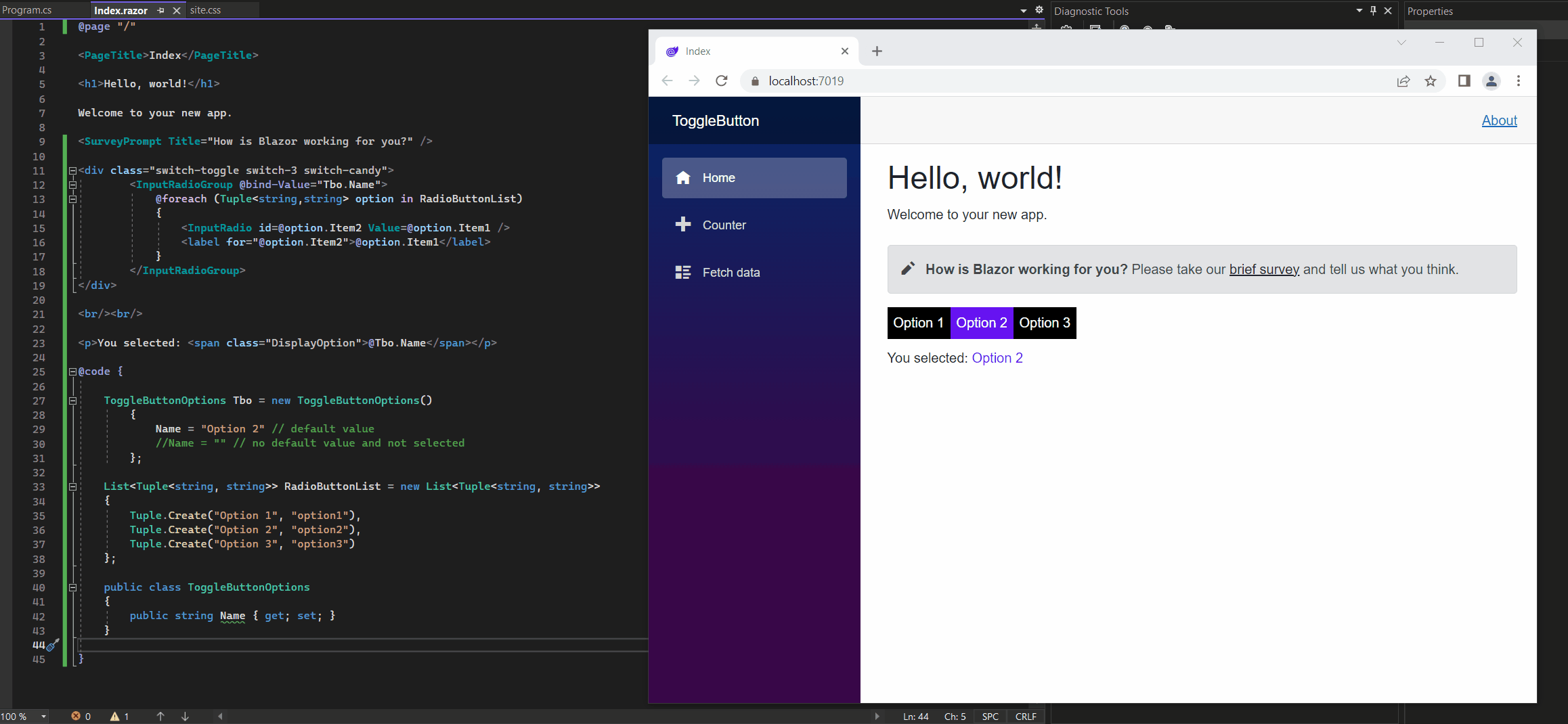
As you can see above, I will use here List Tuples to populate my toogle button radio list. More about List Tuples in C# you can read in my following post.
Create a Razor Component for the Toggle Button
Now I will use the code above with the two .NET classes (components) and put them into a dedicated razor component we can use for several cases to embed into other components or pages.
So I will first create the razor component named ToggleButtonComponent.razor as shown below.
<InputRadioGroup @bind-Value="SelectedValue">
    @foreach (Tuple<string, string> option in RadioButtonList)
    {
        <InputRadio id=@option.Item2 Value=@option.Item1 />
        <label for="@option.Item2">@option.Item1</label>
    }
</InputRadioGroup>

@code {

    [Parameter]
    public EventCallback<string> SelectedValueChanged { get; set; }

    private string _SelectedValue;

    [Parameter]
    public string SelectedValue
    {
        get { return _SelectedValue; }
        set
        {
            if (_SelectedValue != value)
            {
                _SelectedValue = value;
                SelectedValueChanged.InvokeAsync(_SelectedValue);
            }
        }
    }

    // Tuple for Radio Button Value and ID
    [Parameter]
    public List<Tuple<string, string>>? RadioButtonList { get; set; }

}
Then second I will embed this component into my index.razor page as shown below. You can see above that the component is exposing the SelectedValue string property, SelectedValueChanged event and the List Tuple all as parameter decorated.
By embedding the razor component here with its SelectedValueChanged event (exposed as parameter), we subscribe this event in the index.razor page below.
I am also still using here the simplified @bind-SelectedValue Razor directive attribute. More details about this you will find in Part 11 under Simplify the Syntax for Embedding the Component with its Event.
@page "/"

<PageTitle>Index</PageTitle>

<h1>Hello, world!</h1>

Welcome to your new app.

<SurveyPrompt Title="How is Blazor working for you?" />

<div class="switch-toggle switch-3 switch-candy">
      <ToggleButtonComponent @bind-SelectedValue=@Name RadioButtonList="MyRadioButtonList" />
</div>

<br /><br />

<p>You selected: <span class="DisplayOption">@Name</span></p>

@code {

    // default value at first rendering the component
    string Name = "Option 2";

    List<Tuple<string, string>> MyRadioButtonList = new List<Tuple<string, string>>
    {
        Tuple.Create("Option 1", "option1"),
        Tuple.Create("Option 2", "option2"),
        Tuple.Create("Option 3", "option3")
    };

}
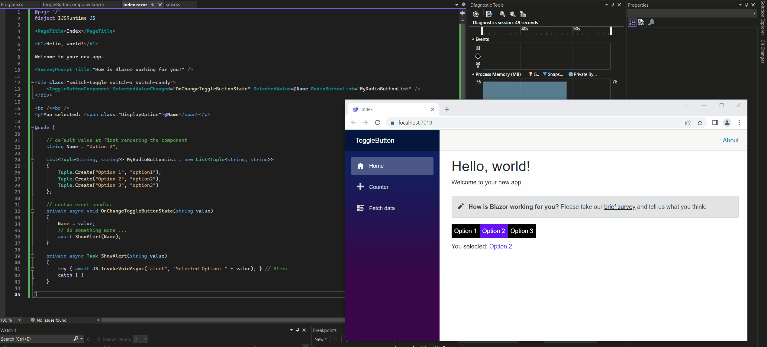
So far when the event is raised in the ToggleButtonComponent.razor component, we just updated the private field in the razor page index.razor which is bind to the component.
As already mentioned and showed in Part 11, we can also execute a custom event handler when an event is raised in the component.
Therefore we need to change the syntax for embedding the component as shown below.
<ToggleButtonComponent SelectedValueChanged="OnChangeToggleButtonState" SelectedValue=@Name RadioButtonList="MyRadioButtonList" />
I will explain this all in detail in Part 11 under Execute a custom Event Handler for the Toggle Switch.
So below the complete code including the custom event handler named OnChangeToggleButtonState() we will execute if the SelecteValueChanged event is raised in the component.
@page "/"
@inject IJSRuntime JS

<PageTitle>Index</PageTitle>

<h1>Hello, world!</h1>

Welcome to your new app.

<SurveyPrompt Title="How is Blazor working for you?" />

<div class="switch-toggle switch-3 switch-candy">
    <ToggleButtonComponent SelectedValueChanged="OnChangeToggleButtonState" SelectedValue=@Name RadioButtonList="MyRadioButtonList" />
</div>

<br /><br />
<p>You selected: <span class="DisplayOption">@Name</span></p>

@code {

    // default value at first rendering the component
    string Name = "Option 2";

    List<Tuple<string, string>> MyRadioButtonList = new List<Tuple<string, string>>
    {
        Tuple.Create("Option 1", "option1"),
        Tuple.Create("Option 2", "option2"),
        Tuple.Create("Option 3", "option3")
    };

    // custom event handler
    private async void OnChangeToggleButtonState(string value)
    {
        Name = value;
        // do something more ...
        await ShowAlert(Name);
    }

    private async Task ShowAlert(string value)
    {
        try { await JS.InvokeVoidAsync("alert", "Selected Option: " + value); } // Alert
        catch { }
    }

}
Now every time the event is raised by changing the selected option, not just the selected value is updated but also our custom event handler, which is calling a Java Script alert function, is executed as shown below.
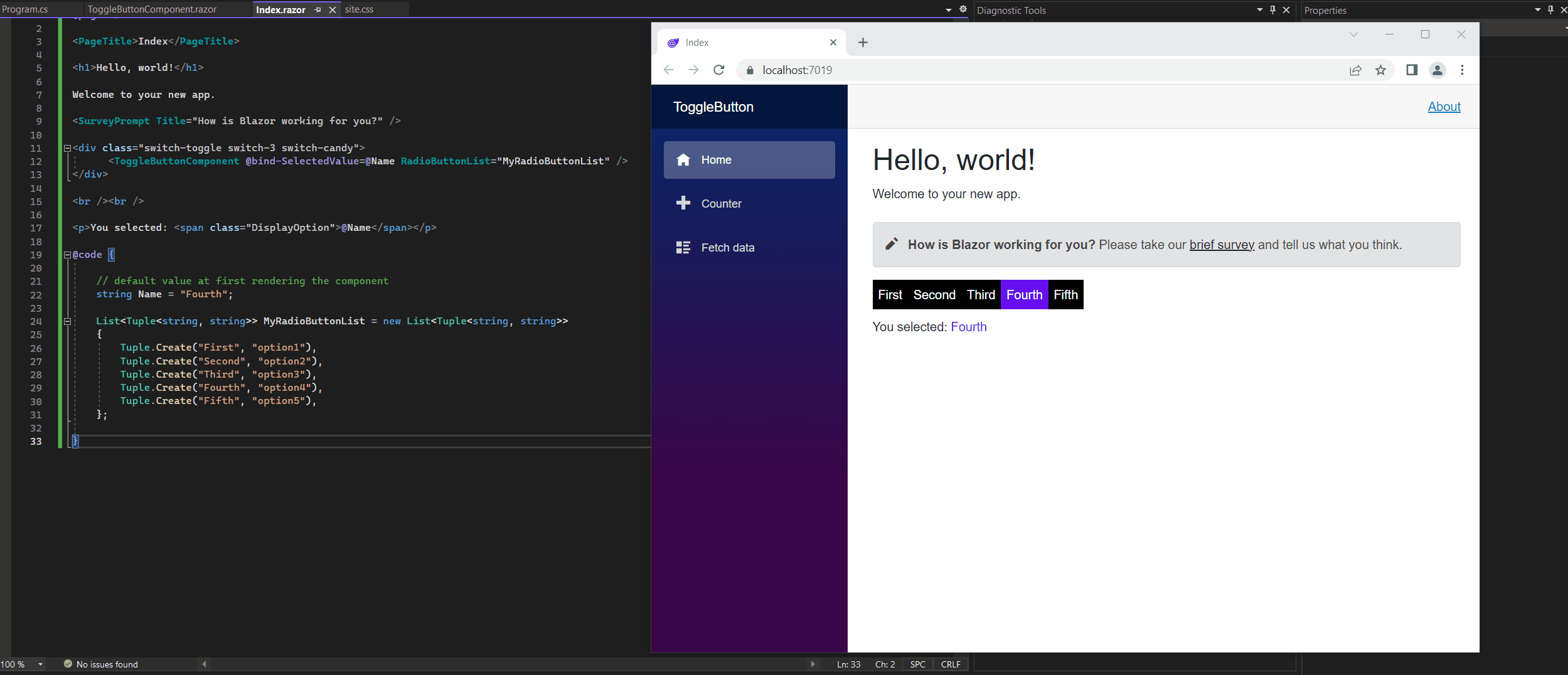
By just adding some more tuples to my List on the index.razor page, I can extend easily my toggle button and also change the names for as shown below.
@code {

    // default value at first rendering the component
    string Name = "Fourth";

    List<Tuple<string, string>> MyRadioButtonList = new List<Tuple<string, string>>
    {
        Tuple.Create("First", "option1"),
        Tuple.Create("Second", "option2"),
        Tuple.Create("Third", "option3"),
        Tuple.Create("Fourth", "option4"),
        Tuple.Create("Fifth", "option5")
    };

}
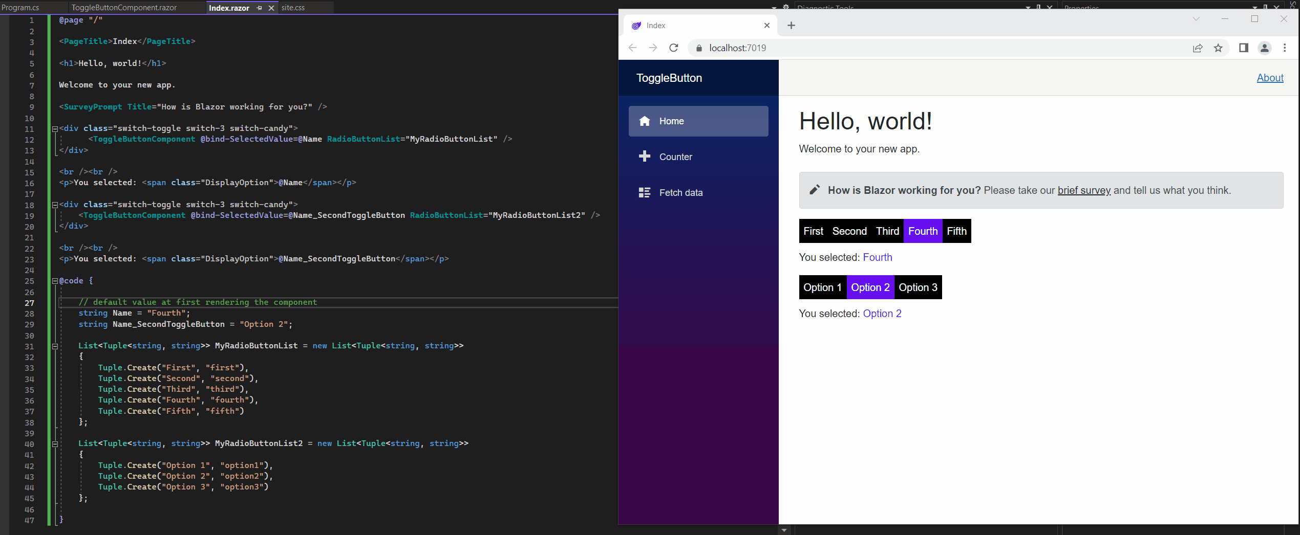
And you can of course also embed the component several times in your razor page by just binding another List to it like shown below.
@page "/"

<PageTitle>Index</PageTitle>

<h1>Hello, world!</h1>

Welcome to your new app.

<SurveyPrompt Title="How is Blazor working for you?" />

<div class="switch-toggle switch-3 switch-candy">
      <ToggleButtonComponent @bind-SelectedValue=@Name RadioButtonList="MyRadioButtonList" />
</div>

<br /><br />
<p>You selected: <span class="DisplayOption">@Name</span></p>

<div class="switch-toggle switch-3 switch-candy">
    <ToggleButtonComponent @bind-SelectedValue=@Name_SecondToggleButton RadioButtonList="MyRadioButtonList2" />
</div>

<br /><br />
<p>You selected: <span class="DisplayOption">@Name_SecondToggleButton</span></p>

@code {

    // default value at first rendering the component
    string Name = "Fourth";
    string Name_SecondToggleButton = "Option 2";

    List<Tuple<string, string>> MyRadioButtonList = new List<Tuple<string, string>>
    {
        Tuple.Create("First", "first"),
        Tuple.Create("Second", "second"),
        Tuple.Create("Third", "third"),
        Tuple.Create("Fourth", "fourth"),
        Tuple.Create("Fifth", "fifth")
    };

    List<Tuple<string, string>> MyRadioButtonList2 = new List<Tuple<string, string>>
    {
        Tuple.Create("Option 1", "option1"),
        Tuple.Create("Option 2", "option2"),
        Tuple.Create("Option 3", "option3")
    };

}
Blazor Server Series
Blazor Server – Basics Part 1
https://blog.matrixpost.net/blazor-server-basics-part-i/Blazor Server – Basics Part 2
https://blog.matrixpost.net/blazor-server-basics-part-ii/Blazor Server – Basics Part 3 – Custom Layout
https://blog.matrixpost.net/blazor-server-basics-part-iii-custom-layout/Blazor Server – Basics Part 4 – Program.cs File
https://blog.matrixpost.net/blazor-server-basics-part-iv-program-cs-file/Blazor Server – Basics Part 5 – Authentication and Authorization
https://blog.matrixpost.net/blazor-server-basics-part-v-authentication-and-authorization/Blazor Server – Basics Part 6 – Query the on-premise Active Directory
https://blog.matrixpost.net/blazor-server-basics-part-vi-query-the-on-premise-active-directory/Blazor Server – Basics Part 7 – C# Events, Delegates and the EventCallback Class
https://blog.matrixpost.net/blazor-server-basics-part-vii-c-events-and-delegates/Blazor Server – Basics Part 8 – JavaScript interoperability (JS interop)
https://blog.matrixpost.net/blazor-server-basics-part-viii-javascript-interoperability-js-interop/Blazor Server – Basics Part 9 – Responsive Tags and Chips
https://blog.matrixpost.net/blazor-server-basics-part-ix-responsive-tags-and-chips/Blazor Server – Basics Part 10 – MS SQL Server Access and Data Binding
https://blog.matrixpost.net/blazor-server-basics-part-10-ms-sql-server-access-and-data-binding/Blazor Server – Basics Part 11 – Create a Native Blazor UI Toggle Switch Component
https://blog.matrixpost.net/blazor-server-basics-part-11-native-blazor-toggle-switch-by-using-the-eventcallback-class-and-css/Blazor Server – Basics Part 12 – Create a Native Blazor UI Toggle Button Component
https://blog.matrixpost.net/blazor-server-basics-part-12-create-a-native-blazor-ui-toggle-button-component/
Links
Radio buttons
https://learn.microsoft.com/en-us/aspnet/core/blazor/forms-and-input-components?view=aspnetcore-7.0#radio-buttonsWorking With Radio Buttons in ASP.NET Razor Pages
https://www.learnrazorpages.com/razor-pages/forms/radios<label>: The Label element
https://developer.mozilla.org/en-US/docs/Web/HTML/Element/labelInputRadioGroup<TValue> Class
https://learn.microsoft.com/en-us/dotnet/api/microsoft.aspnetcore.components.forms.inputradiogroup-1?view=aspnetcore-7.0InputRadio<TValue> Class
https://learn.microsoft.com/en-us/dotnet/api/microsoft.aspnetcore.components.forms.inputradio-1?view=aspnetcore-7.ASP.NET Core Blazor forms and input components
https://learn.microsoft.com/en-us/aspnet/core/blazor/forms-and-input-components?view=aspnetcore-7.0