Blazor Server – Basics Part 11 – Create a Native Blazor UI Toggle Switch Component
As already mentioned in Part 10 about data binding and accessing a MS SQL Server database, in this part we will see how we can create a toggle switch as native Blazor UI component in Blazor Server, by just using HTML, CSS, C# and the EventCallback class.
In a nutshell, the EventCallback<T> class is a special Blazor class, which can be exposed as a Parameter so components they use it, can easily notify consumers (subscribers) about raised events within. Finally it’s also a delegate type which .NET provides like the mentioned events, delegates and EventHandler for classic C# classes as shown in my following post but dedicated for use with Blazor components.
More details about the EventCallback<T> class, events and delegates, you will find in my following post.
- Razor Page vs. Razor Component
- Create the CSS for our Toggle Switch
- Create a Toggle Switch directly in a Razor Page
- Create a Razor Component for the Toggle Switch
- Embed the Toggle Razor Component to a Razor Page
- Simplify the Syntax for Embedding the Component with its Event
- Execute a custom Event Handler for the Toggle Switch
- Another real cool Toogle Switch | Embedding the same Component multiple times into other Components
- Blazor Server Series
- Links
Razor Page vs. Razor Component
Because I will constantly use the terms razor page and razor component (informally known as Blazor components) in this post, first what’s the difference between them?
To tell you right away, technically not much, a razor page is finally also a component.
A component is a self-contained portion of user interface (UI) with processing logic to enable dynamic behavior. Components can be nested, reused, shared among projects, and used in MVC and Razor Pages apps.
Components are implemented using a combination of C# and HTML markup in Razor component files with the .razor file extension.
Components use Razor syntax. There is one razor feature which is called directive and uses a reserved keyword prefix with the @ symbol.
One of these directives are the @page directive which will finally makes the difference if it’s a razor page or razor component.
The @page directive specifies a routable component with a route template and can be reached directly by a user’s request in the browser at a specific URL. So a razor component which includes the @page directive is called a razor page.
Soure: https://learn.microsoft.com/en-us/aspnet/core/blazor/components/?view=aspnetcore-7.0
Create the CSS for our Toggle Switch
A toggle switch is an html input element with an input type from checkbox. That it finally looks like a real switch we need to create and apply a bunch of CSS styles to it.
I will use here the CSS styles from the following page and adjust it a little bit.
How TO – Toggle Switch
https://www.w3schools.com/howto/howto_css_switch.asp
/* Begin Toggle Switch*/

/* The switch - the box around the slider */
.switch {
    position: relative;
    display: inline-block;
    width: 70px;
    height: 34px;
}

    /* Hide default HTML checkbox */
    .switch input {
        opacity: 0;
        width: 0;
        height: 0;
    }

/* The slider */
.slider {
    position: absolute;
    cursor: pointer;
    top: 0;
    left: 0;
    right: 0;
    bottom: 0;
    background-color: #ccc;
    -webkit-transition: .4s;
    transition: .4s;
}

    .slider:before {
        position: absolute;
        content: "";
        height: 26px;
        width: 26px;
        left: 4px;
        bottom: 4px;
        background-color: white;
        -webkit-transition: .4s;
        transition: .4s;
    }

input:checked + .slider {
    background-color: #6610f2;
}

input:focus + .slider {
    box-shadow: 0 0 1px #6610f2;
}

input:checked + .slider:before {
    -webkit-transform: translateX(36px);
    -ms-transform: translateX(36px);
    transform: translateX(36px);
}

/* Rounded sliders */
.slider.round {
    border-radius: 34px;
}

    .slider.round:before {
        border-radius: 50%;
    }


/*End Toggle Switch*/
Create a Toggle Switch directly in a Razor Page
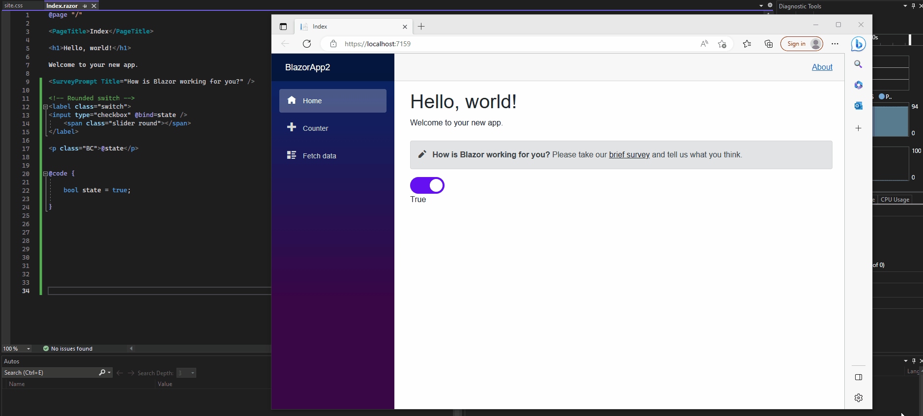
The easiest way to create a toggle switch for your Blazor Sever web app, is by embedding it directly in a razor page.
Therefore we don’t need to use the EventCallback<T> class, to notify razor components when the state of the toggle switch has been changed. The event in this case is raised in the same component (here razor page) as we created the toggle switch and therefore we don’t need to use a callback parameter.
Below for example I will place the toggle switch html code directly in the index.razor page. We just bind here the private bool field named state as bool value for checked or not.
@page "/"

<PageTitle>Index</PageTitle>

<h1>Hello, world!</h1>

Welcome to your new app.

<SurveyPrompt Title="How is Blazor working for you?" />

<!-- Rounded switch -->
<label class="switch">
<input type="checkbox" @bind=state />
    <span class="slider round"></span>
</label>

<p class="BC">@state</p>

@code {

    bool state = true;
}
Below we will see how to create this toggle switch as a razor component in order to embed it into other razor pages.
Therefore we need to use the mentioned EventCallback<T> class to notify the razor pages they will use it about its state changes and raising an event if it changes.
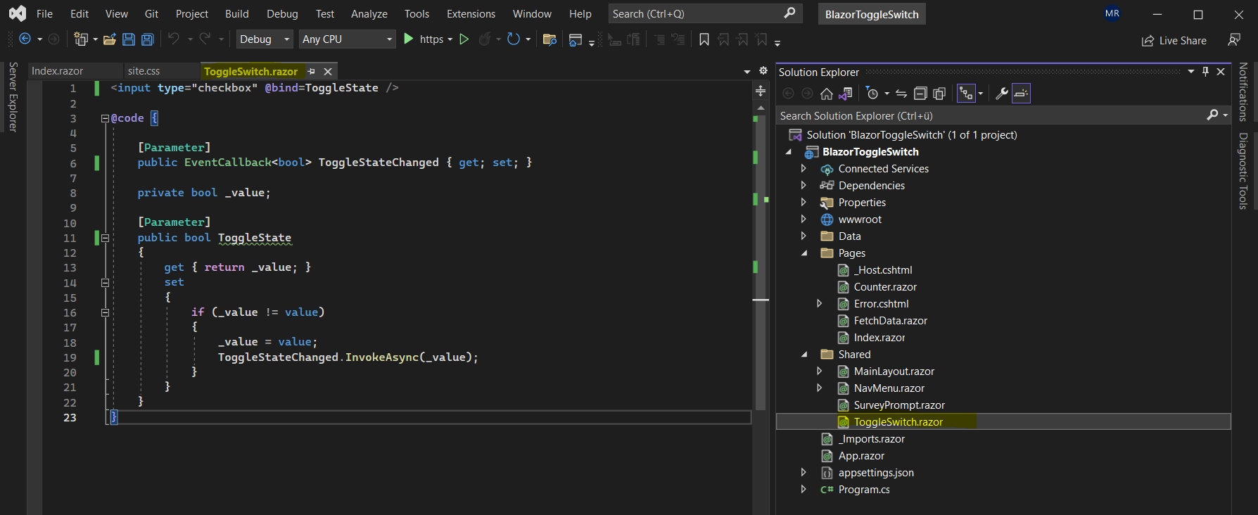
Create a Razor Component for the Toggle Switch
Our html input element with the input type checkbox we create in the separate Razor component. I will place it in the Shared folder as usual for components and for the name I will use ToggleSwitch.razor.
Here we also will declare a new callback parameter and decorate it with the [Parameter] attribute. Further we declared a private field, expose a property also decorated with the [Parameter] attribut and raising an event when the value is changed.
<input type="checkbox" @bind=ToggleState />
@code {

    [Parameter]
    public EventCallback<bool> ToggleStateChanged { get; set; }

    private bool _value;

    [Parameter]
    public bool ToggleState
    {
        get { return _value; }
        set
        {
            if (_value != value)
            {
                _value = value;
                ToggleStateChanged.InvokeAsync(_value);
            }
        }
    }
}
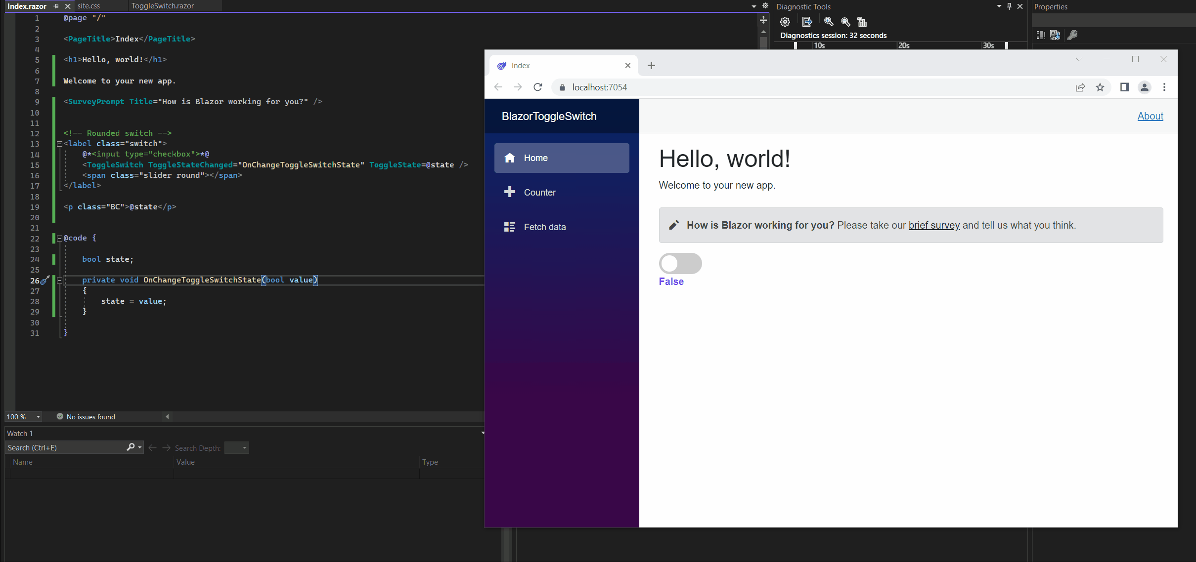
Embed the Toggle Razor Component to a Razor Page
Now we can embed this toggle switch component to the razor page we want to use it. In my example I will use it in the Index.razor page.
Below you can see that I will place the razor component with the toggle switch into the html structure with the <label> and <span> tag from our html + css template for the toggle switch from the following article. This razor component will replace the native html input element which I commented here.
How TO – Toggle Switch
https://www.w3schools.com/howto/howto_css_switch.asp
By embedding the razor component here with its ToggleStateChanged event (exposed as parameter) and assigned event handler OnChangeToggleSwitchState(), we subscribe this event in the index.razor page.
<!-- Rounded switch -->
<label class="switch">
    @*<input type="checkbox">*@
    <ToggleSwitch ToggleStateChanged="OnChangeToggleSwitchState" ToggleState=@state />
    <span class="slider round"></span>
</label>
After that code I was inserting a <p> tag to display the selected state of the toggle switch. The selected state will be shown by a private bool field named state.
Its value if true or false will be updated by the OnChangeToggleSwitchState() event handler shown further down.
<p class="BC">@state</p>
So finally we need to add the following code within the @code directive. First we need to declare a private field from type bool which will hold the actual state and is setting the value attribute of our toggle switch to false or true.
Then we need to add the previously mentioned event handler which is updating the state (value attribute) of the toggle switch.
@code {

    bool state;

    private void OnChangeToggleSwitchState(bool value)
    {
        state = value;
    }

}
The complete code for the Index.razor page.
@page "/"

<PageTitle>Index</PageTitle>

<h1>Hello, world!</h1>

Welcome to your new app.

<SurveyPrompt Title="How is Blazor working for you?" />


<!-- Rounded switch -->
<label class="switch">
    <ToggleSwitch ToggleStateChanged="OnChangeToggleSwitchState" ToggleState=@state />
    <span class="slider round"></span>
</label>

<p class="BC">@state</p>
@code {
bool state;
private void OnChangeToggleSwitchState(bool value)
{
state = value;
}
}
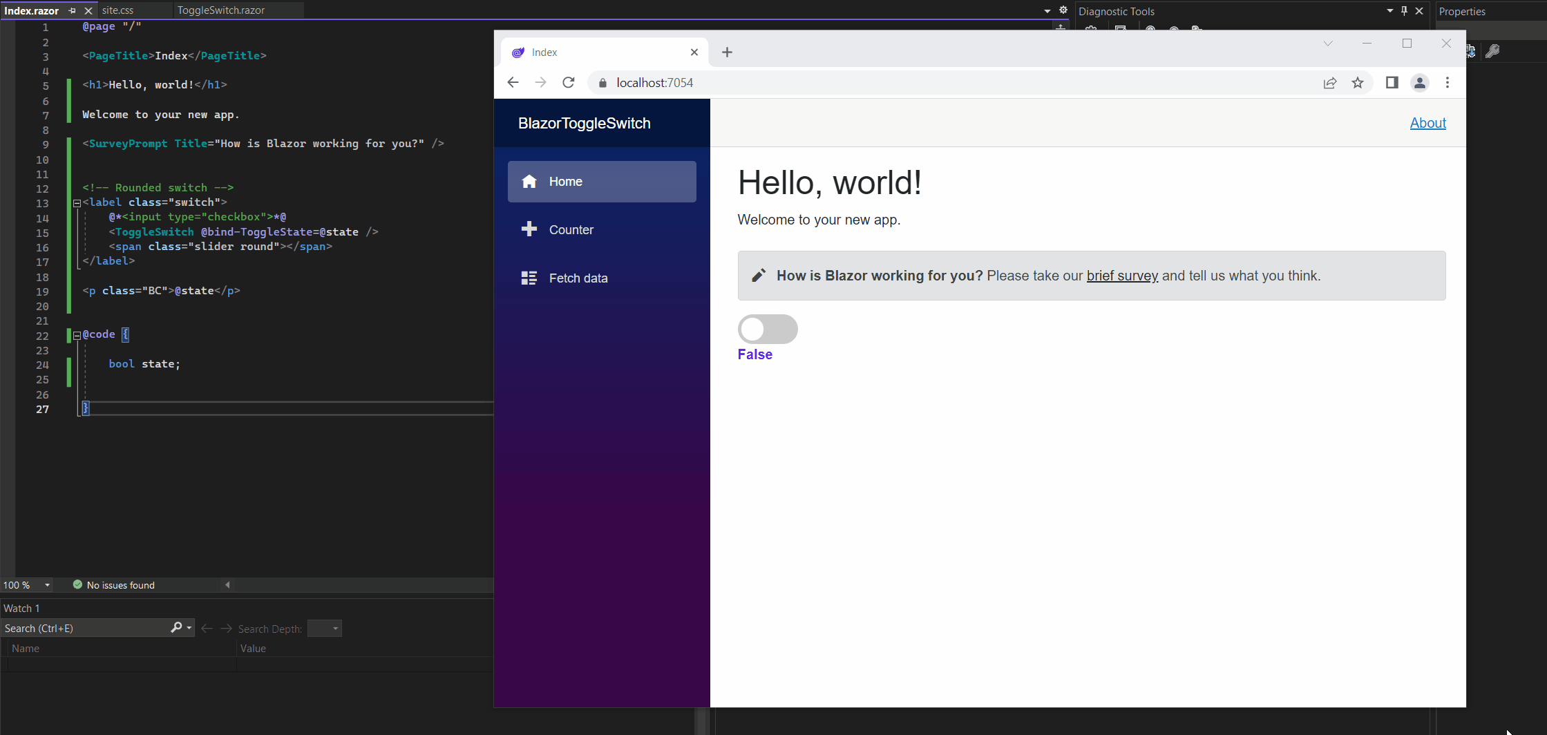
Simplify the Syntax for Embedding the Component with its Event
Actually just to update the state of the toggle switch, we do not really need to declare within the razor component declaration the ToggleStateChanged event and its assigned event handler OnChangeToggleSwitchState() as shown below. I just use this syntax to better understand what’s happening here.
<ToggleSwitch ToggleStateChanged=”OnChangeToggleSwitchState” ToggleState=@state />
In Part 10 I was showing that the @bind Razor directive attribute for the <input> element will set up in the background an event handler for the onchange event of the <input> element by default without any additional code.
So to embed the razor component and subscribe its ToggleStateChanged event, we can also just use the following syntax and therefore do not need to implement the OnChangeToggleSwitchState() method (event handler) as shown above. The syntax below will also update the state for the toggle switch by executing the ToggleStateChanged event in the background.
<ToggleSwitch @bind-ToggleState=@state />
But what is the @bind-ToggleState Razor directive attribute here in contrast to the @bind attribute which will execute in the background the onchange event by default as mentioned?
The @bind-ToggleState attribute will bind a property of a child component (here my ToggleSwitch.razor component and its ToggleState property decorated as parameter) to a property in its parent component (here my index.razor page with the actual state property, true or false).
Further it will also execute by default in the background the ToggleStateChanged event and is equivalent to the following syntax.
<ToggleSwitch @bind-ToggleState=@state @bind-ToggleState:event=”ToggleStateChanged” />
The syntax for this attribute is @bind-{PROPERTY} where the {PROPERTY} placeholder is the property to bind, in my case the ToggleState property decorated as parameter.
More about how to bind component parameter and execute event handler when an event is raised you will find in the following article.
Binding with component parameters
https://learn.microsoft.com/en-us/aspnet/core/blazor/components/data-binding?view=aspnetcore-6.0#binding-with-component-parameters-1
So simplified the complete code from our index.razor page will now looks like this.
@page "/"

<PageTitle>Index</PageTitle>

<h1>Hello, world!</h1>

Welcome to your new app.

<SurveyPrompt Title="How is Blazor working for you?" />


<!-- Rounded switch -->
<label class="switch">
    @*<input type="checkbox">*@
    <ToggleSwitch @bind-ToggleState=@state />
    <span class="slider round"></span>
</label>

<p class="BC">@state</p>
@code {
bool state;
}
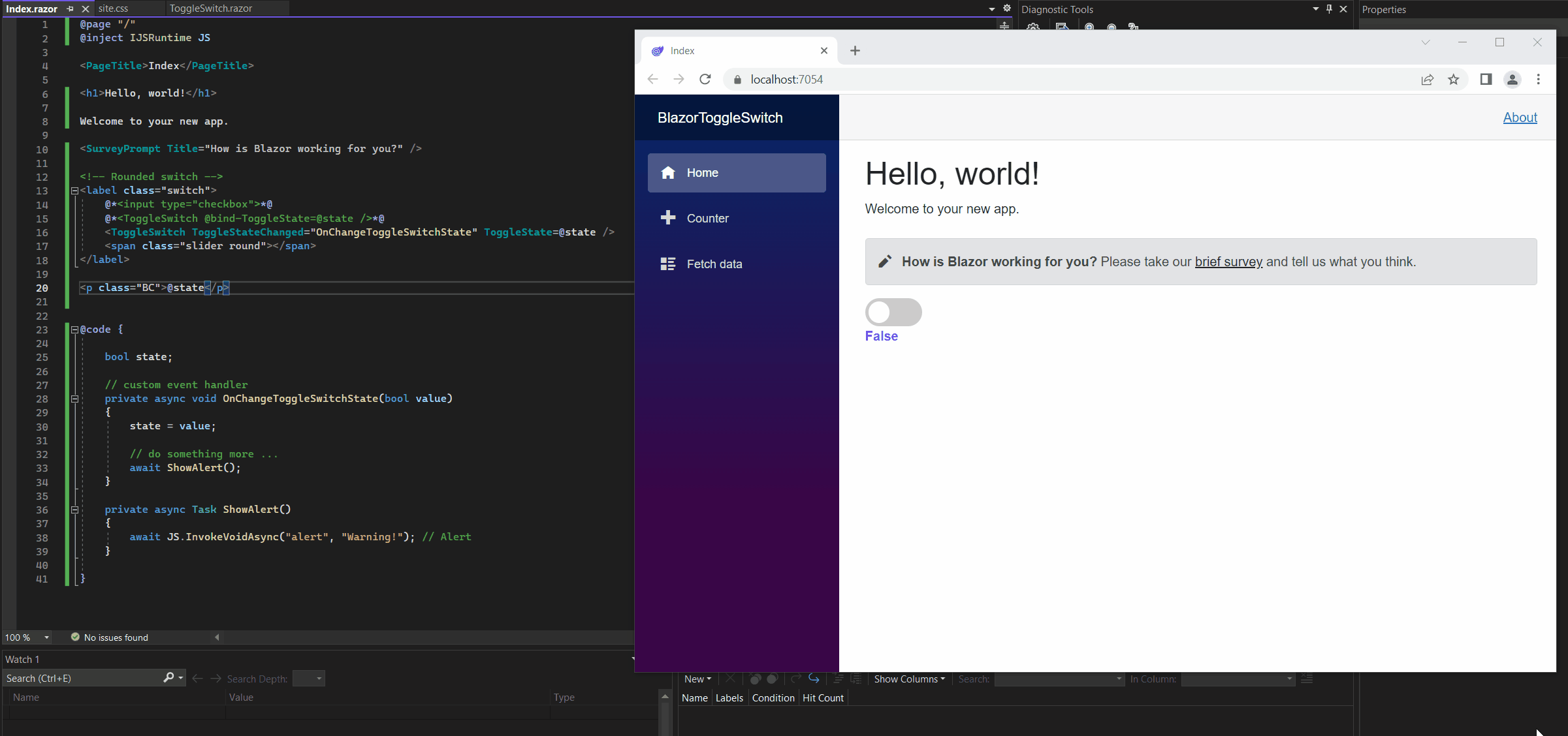
Execute a custom Event Handler for the Toggle Switch
One last point, you remeber the first embedding of our ToggleSwitch.razor component to the index.razor page?
Here I was using the following syntax to implement the udpate of the toggle switch component in the index.razor page by declaring a custom event handler.
<!-- Rounded switch -->
<label class="switch">
    @*<input type="checkbox">*@
    <ToggleSwitch ToggleStateChanged="OnChangeToggleSwitchState" ToggleState=@state />
    <span class="slider round"></span>
</label>
We saw how to simplify this by just using the following syntax
<ToggleSwitch @bind-ToggleState=@state />
In case the ToggleStateChanged event is raised in the ToggleSwitch.razor component and you want not just to update its state in the index.razor page, but also execute some other code, you can still use this syntax in order to execute a custom event handler like the OnChangeToggleSwitchState() in the example below.
Here everytime you click on the toggle switch, not just its state if true of false should be updated, but also a JavaScript alert should be popped up when you clicked on it.
@page "/"
@inject IJSRuntime JS

<PageTitle>Index</PageTitle>

<h1>Hello, world!</h1>

Welcome to your new app.

<SurveyPrompt Title="How is Blazor working for you?" />


<!-- Rounded switch -->
<label class="switch">
    @*<input type="checkbox">*@
    @*<ToggleSwitch @bind-ToggleState=@state />*@
    <ToggleSwitch ToggleStateChanged="OnChangeToggleSwitchState" ToggleState=@state />
    <span class="slider round"></span>
</label>

<p class="BC">@state</p>
@code {
bool state;
// custom event handler
private async void OnChangeToggleSwitchState(bool value)
{
state = value;
// do something more ...
await ShowAlert();
}
private async Task ShowAlert()
{
await JS.InvokeVoidAsync("alert", "Warning!"); // Alert
}
}
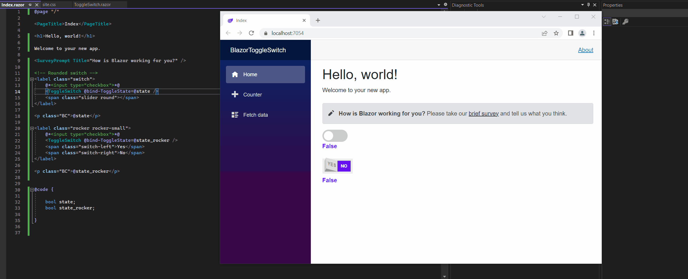
Another real cool Toogle Switch | Embedding the same Component multiple times into other Components
Below I just want to show another real cool template for a toggle switch I found on the web. All credit about the CSS style goes to @bandirevanth.
Further we will see how to embed a component multiple times into other components by just using different fields to store the state for each instance.
The HTML markup and corresponding CSS file you will also find in the link below.
<label class="rocker rocker-small">
    <input type="checkbox">
    <span class="switch-left">Yes</span>
    <span class="switch-right">No</span>
</label>
For the CSS style I just have adjusted the color and commented the margin from the <label> tag to position it directly below my first toggle switch.
/* Switch starts here */
.rocker {
    display: inline-block;
    position: relative;
    /*
  SIZE OF SWITCH
  ==============
  All sizes are in em - therefore
  changing the font-size here
  will change the size of the switch.
  See .rocker-small below as example.
  */
    font-size: 2em;
    font-weight: bold;
    text-align: center;
    text-transform: uppercase;
    color: #888;
    width: 7em;
    height: 4em;
    overflow: hidden;
    border-bottom: 0.5em solid #eee;
}

.rocker-small {
    font-size: 0.75em;
    /* Sizes the switch */
/*    margin: 1em;*/
}

.rocker::before {
    content: "";
    position: absolute;
    top: 0.5em;
    left: 0;
    right: 0;
    bottom: 0;
    background-color: #999;
    border: 0.5em solid #eee;
    border-bottom: 0;
}

.rocker input {
    opacity: 0;
    width: 0;
    height: 0;
}

.switch-left,
.switch-right {
    cursor: pointer;
    position: absolute;
    display: flex;
    align-items: center;
    justify-content: center;
    height: 2.5em;
    width: 3em;
    transition: 0.2s;
    user-select: none;
}

.switch-left {
    height: 2.4em;
    width: 2.75em;
    left: 0.85em;
    bottom: 0.4em;
    background-color: #ddd;
    transform: rotate(15deg) skewX(15deg);
}

.switch-right {
    right: 0.5em;
    bottom: 0;
    /*    background-color: #bd5757;*/
    background-color: #6610f2;
    color: #fff;
}

    .switch-left::before,
    .switch-right::before {
        content: "";
        position: absolute;
        width: 0.4em;
        height: 2.45em;
        bottom: -0.45em;
        background-color: #ccc;
        transform: skewY(-65deg);
    }

.switch-left::before {
    left: -0.4em;
}

.switch-right::before {
    right: -0.375em;
    background-color: transparent;
    transform: skewY(65deg);
}

input:checked + .switch-left {
    /*background-color: #0084d0;*/
    background-color: #6610f2;
    color: #fff;
    bottom: 0px;
    left: 0.5em;
    height: 2.5em;
    width: 3em;
    transform: rotate(0deg) skewX(0deg);
}

    input:checked + .switch-left::before {
        background-color: transparent;
        width: 3.0833em;
    }

    input:checked + .switch-left + .switch-right {
        background-color: #ddd;
        color: #888;
        bottom: 0.4em;
        right: 0.8em;
        height: 2.4em;
        width: 2.75em;
        transform: rotate(-15deg) skewX(-15deg);
    }

        input:checked + .switch-left + .switch-right::before {
            background-color: #ccc;
        }

/* Keyboard Users */
input:focus + .switch-left {
    color: #333;
}

input:checked:focus + .switch-left {
    color: #fff;
}

input:focus + .switch-left + .switch-right {
    color: #fff;
}

input:checked:focus + .switch-left + .switch-right {
    color: #333;
}
Finally we just need to embed the ToggleSwitch.razor component a second time to our index.razor page by binding another private bool field (bool state_rocker) which will store the state for this second toggle switch.
Below the complete code for the index.razor page.
@page "/"

<PageTitle>Index</PageTitle>

<h1>Hello, world!</h1>

Welcome to your new app.

<SurveyPrompt Title="How is Blazor working for you?" />

<!-- Rounded switch -->
<label class="switch">
    @*<input type="checkbox">*@
    <ToggleSwitch @bind-ToggleState=@state />
    <span class="slider round"></span>
</label>

<p class="BC">@state</p>

<label class="rocker rocker-small">
    @*<input type="checkbox">*@
    <ToggleSwitch @bind-ToggleState=@state_rocker />
    <span class="switch-left">Yes</span>
    <span class="switch-right">No</span>
</label>

<p class="BC">@state_rocker</p>
@code {
bool state;
bool state_rocker;
}So this is also a good example to show that you can embed a component not just once but multiple times into other components or pages by binding different fields to store the state for each instance.
Blazor Server Series
Blazor Server – Basics Part 1
https://blog.matrixpost.net/blazor-server-basics-part-i/Blazor Server – Basics Part 2
https://blog.matrixpost.net/blazor-server-basics-part-ii/Blazor Server – Basics Part 3 – Custom Layout
https://blog.matrixpost.net/blazor-server-basics-part-iii-custom-layout/Blazor Server – Basics Part 4 – Program.cs File
https://blog.matrixpost.net/blazor-server-basics-part-iv-program-cs-file/Blazor Server – Basics Part 5 – Authentication and Authorization
https://blog.matrixpost.net/blazor-server-basics-part-v-authentication-and-authorization/Blazor Server – Basics Part 6 – Query the on-premise Active Directory
https://blog.matrixpost.net/blazor-server-basics-part-vi-query-the-on-premise-active-directory/Blazor Server – Basics Part 7 – C# Events, Delegates and the EventCallback Class
https://blog.matrixpost.net/blazor-server-basics-part-vii-c-events-and-delegates/Blazor Server – Basics Part 8 – JavaScript interoperability (JS interop)
https://blog.matrixpost.net/blazor-server-basics-part-viii-javascript-interoperability-js-interop/Blazor Server – Basics Part 9 – Responsive Tags and Chips
https://blog.matrixpost.net/blazor-server-basics-part-ix-responsive-tags-and-chips/Blazor Server – Basics Part 10 – MS SQL Server Access and Data Binding
https://blog.matrixpost.net/blazor-server-basics-part-10-ms-sql-server-access-and-data-binding/Blazor Server – Basics Part 11 – Create a Native Blazor UI Toggle Switch Component
https://blog.matrixpost.net/blazor-server-basics-part-11-native-blazor-toggle-switch-by-using-the-eventcallback-class-and-css/Blazor Server – Basics Part 12 – Create a Native Blazor UI Toggle Button Component
https://blog.matrixpost.net/blazor-server-basics-part-12-create-a-native-blazor-ui-toggle-button-component/
Links
How TO – Toggle Switch
https://www.w3schools.com/howto/howto_css_switch.aspBinding with component parameters
https://learn.microsoft.com/en-us/aspnet/core/blazor/components/data-binding?view=aspnetcore-6.0#binding-with-component-parameters-Component parameters
https://learn.microsoft.com/en-us/aspnet/core/blazor/components/?view=aspnetcore-6.0#component-parameters-1ASP.NET Core Razor components
https://learn.microsoft.com/en-us/aspnet/core/blazor/components/?view=aspnetcore-7.0Checkboxes in a Razor Pages Form
https://www.learnrazorpages.com/razor-pages/forms/checkboxes